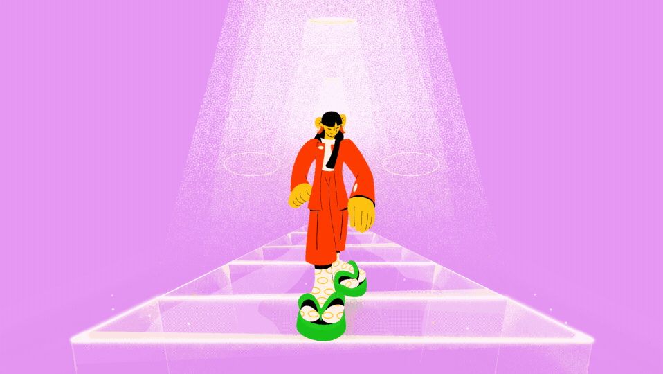
In 2022 I was invited by BUCK to work on the Cartoon Network rebrand. Developing assets in a 360˚ level, the rebrand brings more inclusivity to the visuals while keeping the fun and vibrant feel.
I had the honor to put my hands on most of the animations, while being in charge to create and standardize the toolkit files and deliverables, alongside staff animators from BUCK.
I had the honor to put my hands on most of the animations, while being in charge to create and standardize the toolkit files and deliverables, alongside staff animators from BUCK.
For this case study I had the help of Emilia Tonello, who worked in the design stage of the project and let me borrow some of her great designs/writing.
Logo + Typography + Color Code (writing and case layout by Emilia Tonello)
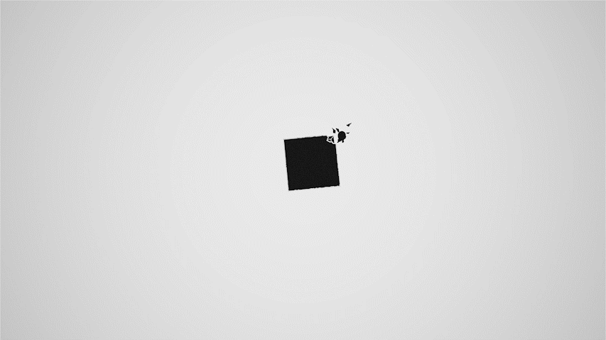
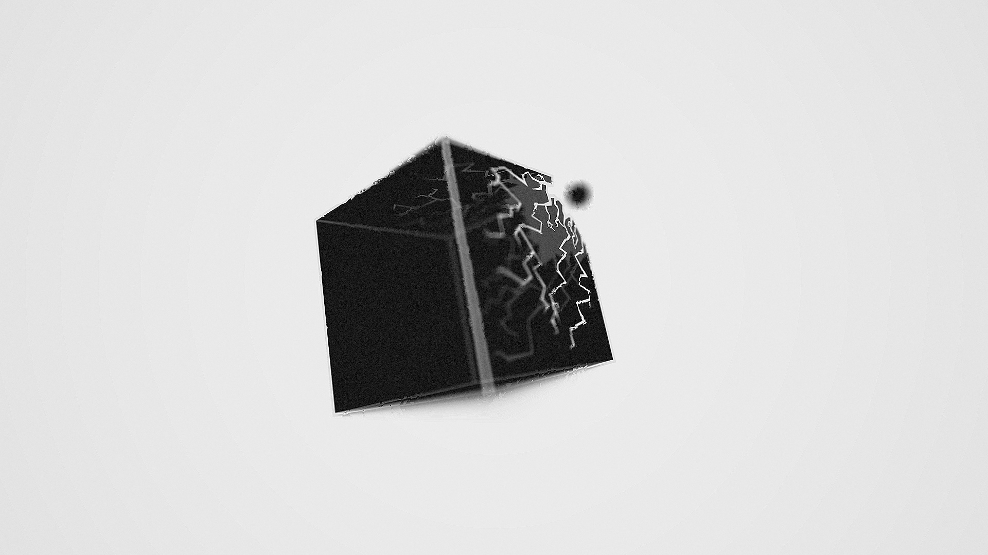
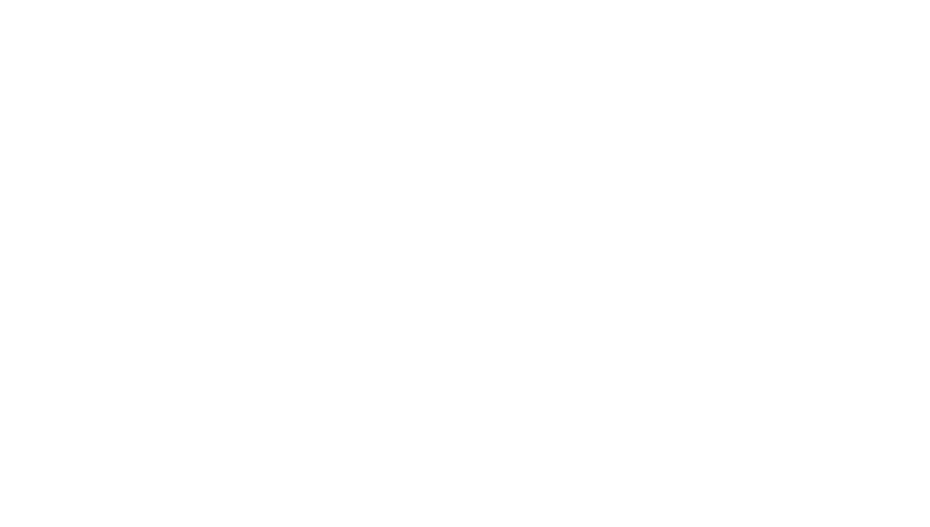
The classic Cartoon Network logo served as our jumping off point. The circle & square are graphic motifs that form the foundation of the visual brand language, derived from the roundness of the ‘C’ and the squareness of the ’N’ — creating a graphic interplay for various characters to interact within them.
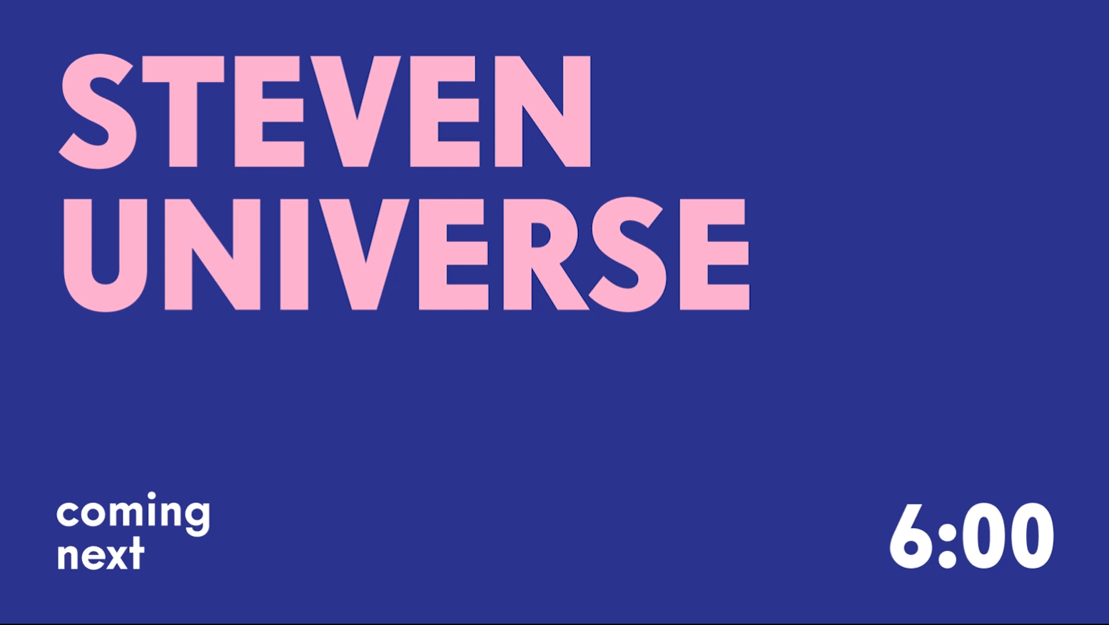
For the typography, we updated the san serif typeface to Intervogue Alt Black and Alt Bold.
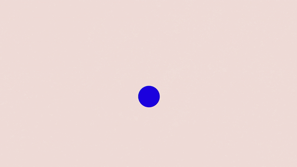
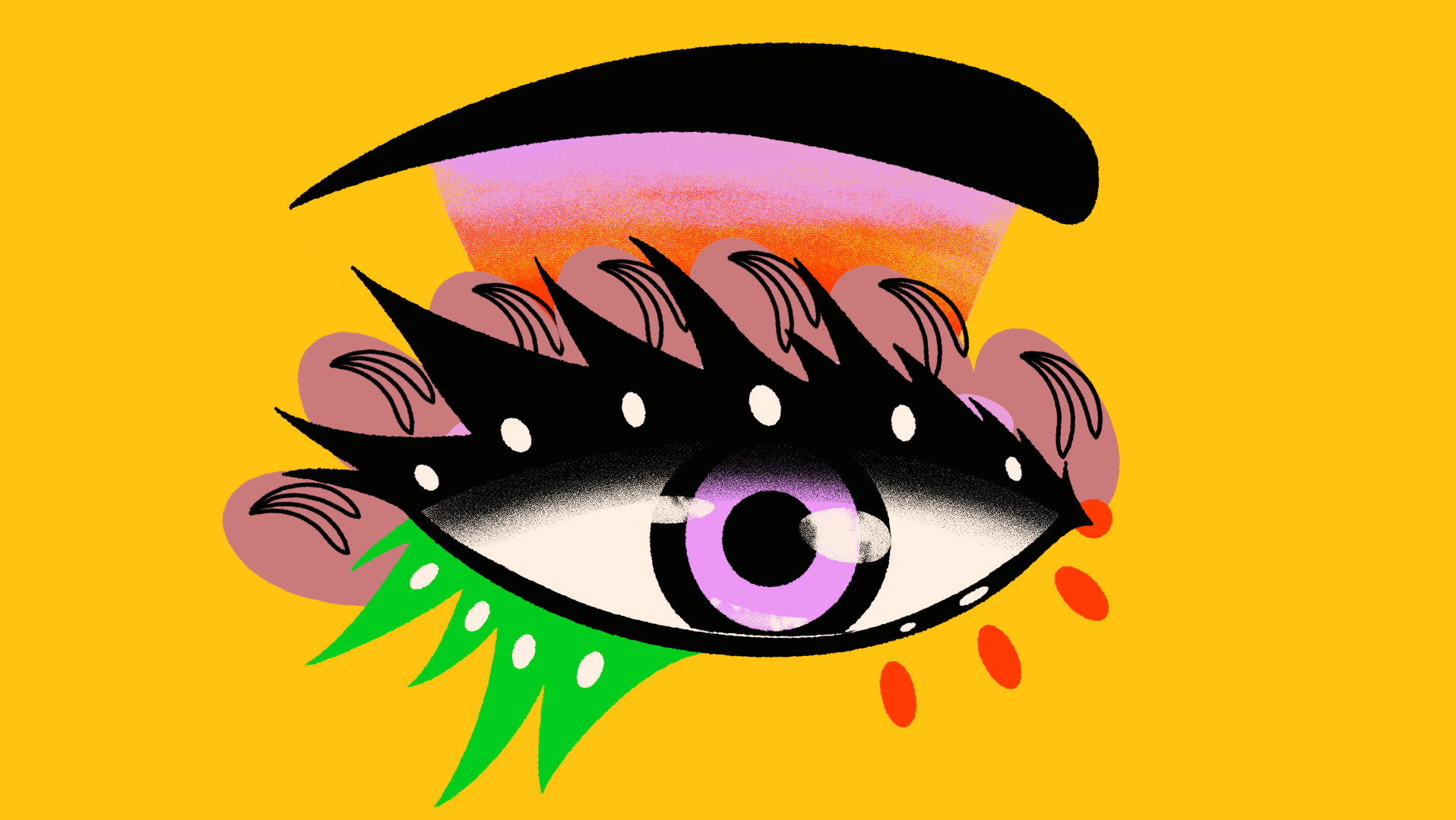
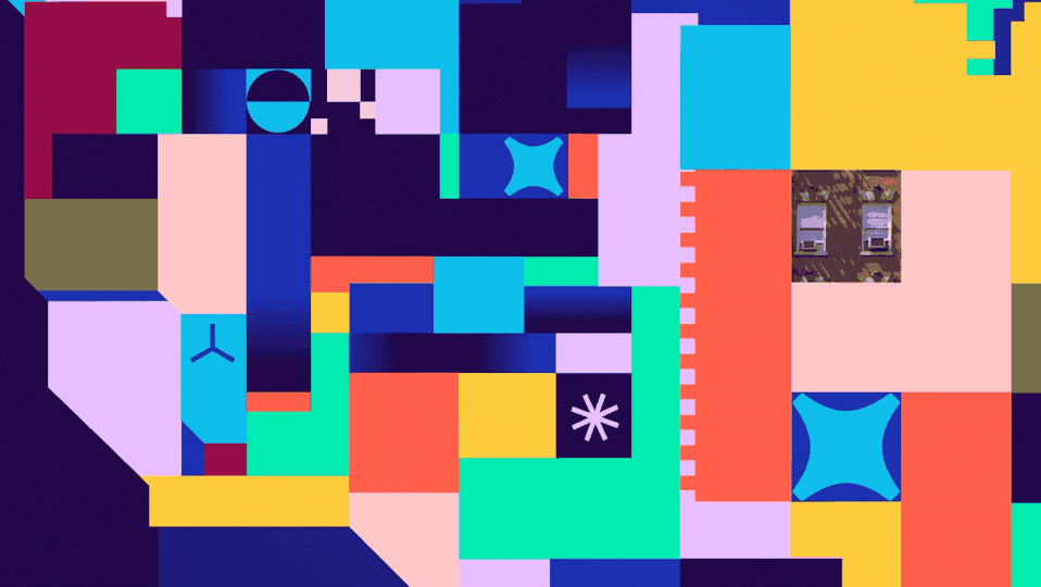
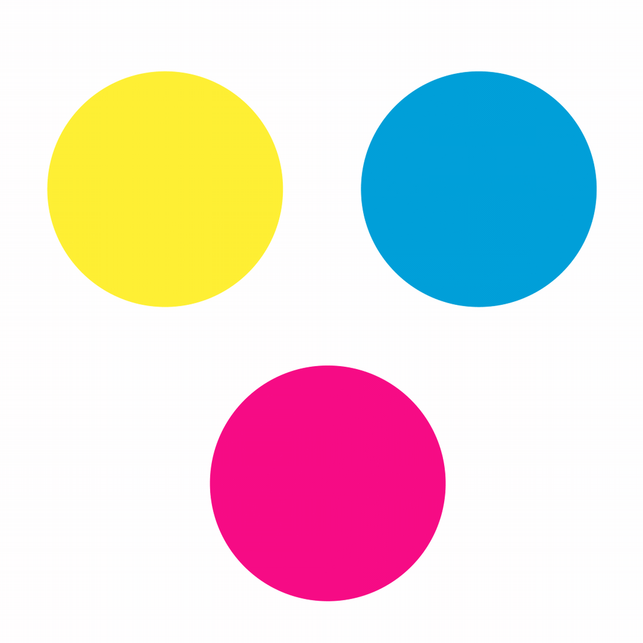
For our color palette refresh, we wanted to create something that felt distinctly Cartoon Network while appealing to a more inclusive audience. We merged the existing color palette of Cyan, Magenta, and Yellow with a secondary palette of Indigo, Rose, and Green.


Prism (writing and case layout by Emilia Tonello)
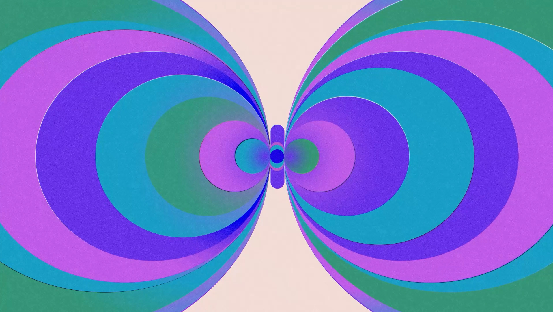
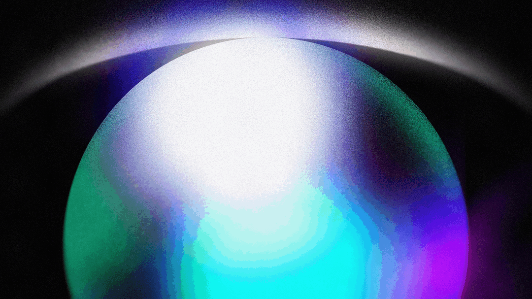
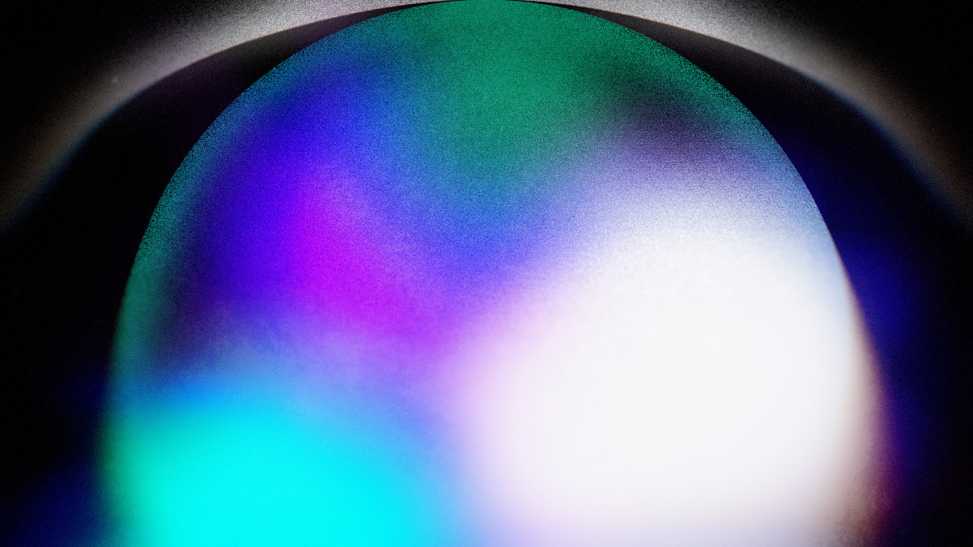
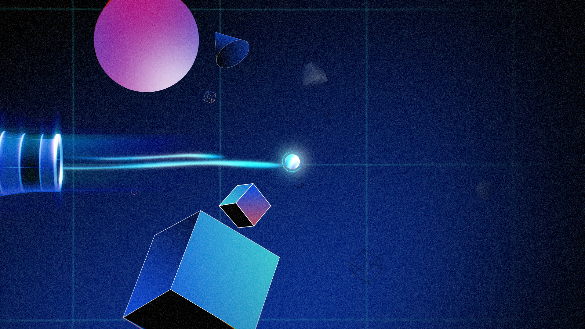
Our updated color palette provided an opportunity to use an exciting, new visual device: the prism. The prism was born out of the effect created when overlapping the colors in the original color palette. The optical artifact created acts as an energizing force in the visual language. It allows for dynamic brand expression, uniting various content types while also working as a transitional element. The prism uses gradients, refraction, aberration, and “bits & sparkles” in order to create its effect.

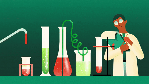
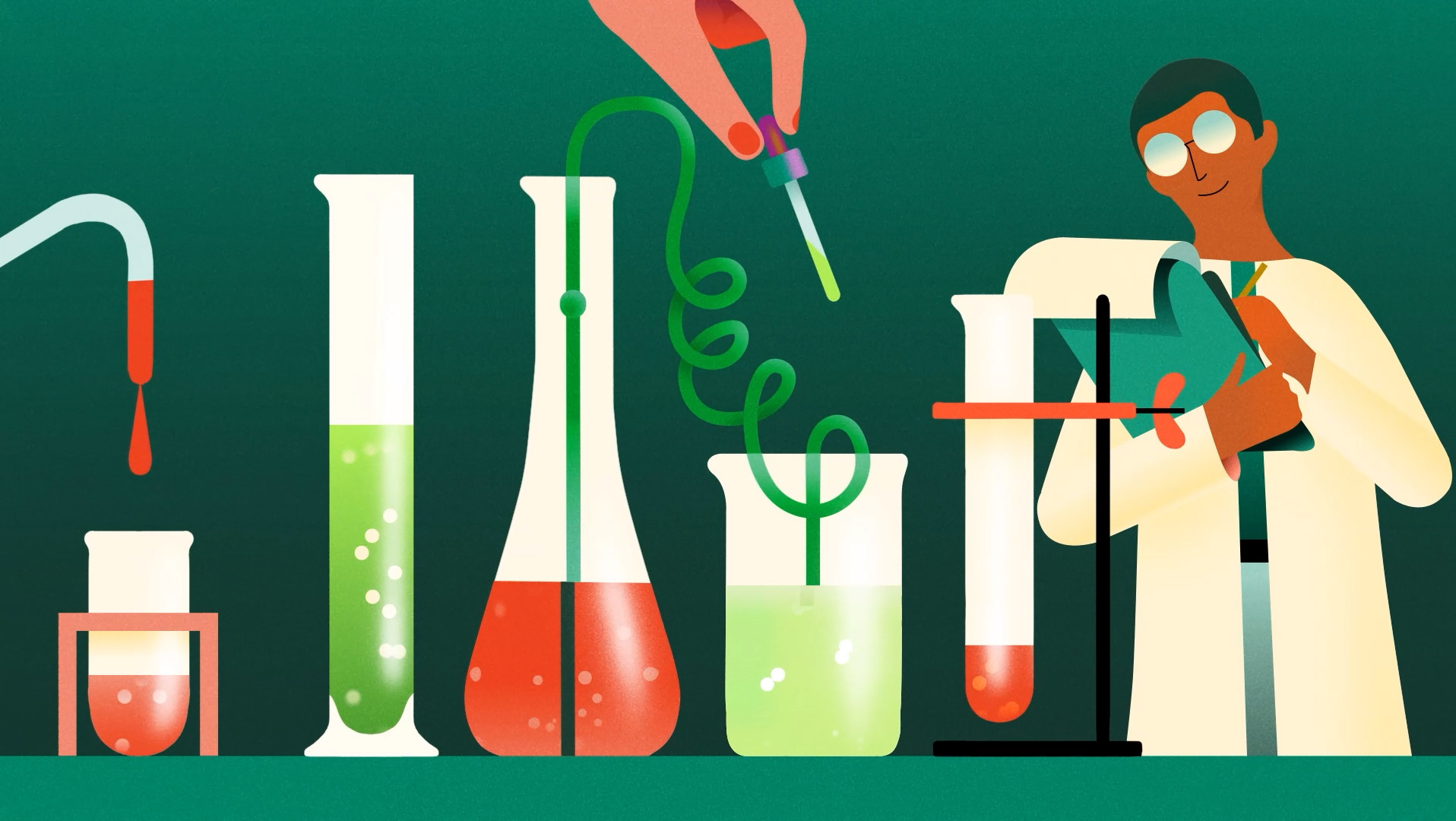
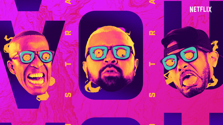
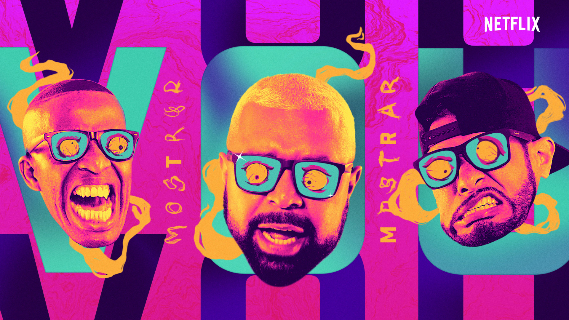
Static Design (writing and case layout by Emilia Tonello)
Our statics were inspired by how our designs behave in motion. Our goal was to infuse all static elements with a potential kinetic energy. The prism, for example, was primarily a motion device; but when used as a static, the motion blur makes it almost appear as if we captured a title sequence transition in freeze frame.


Graphic Language (case layout by Emilia Tonello)

Logo Animations
The logo animations were created using the personalities of the circle and square. The circle, linking to the C, is very fun, dynamic and rubber-ish, using squash & stretch quite a bit. In opposition to that, the square links to the N, being a bit more rigid and having sober animations overall.
Stingers
With the mission of creating two stingers (a short and a long one), we explored two different paths, both using famous CN IP's.
Stinger A references the CN logo from beginning to end, using footages and framings that resembles the circular shape of the C on the left and the square shape of the N on the right.
Stinger B on the other hand is more edit-like and ends with the prism/logo animation. It plays with an exquisite corpse vibe in a very dynamic cut.
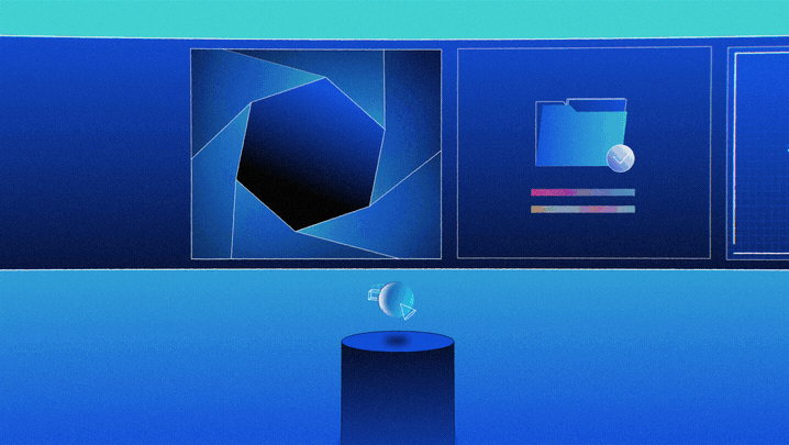
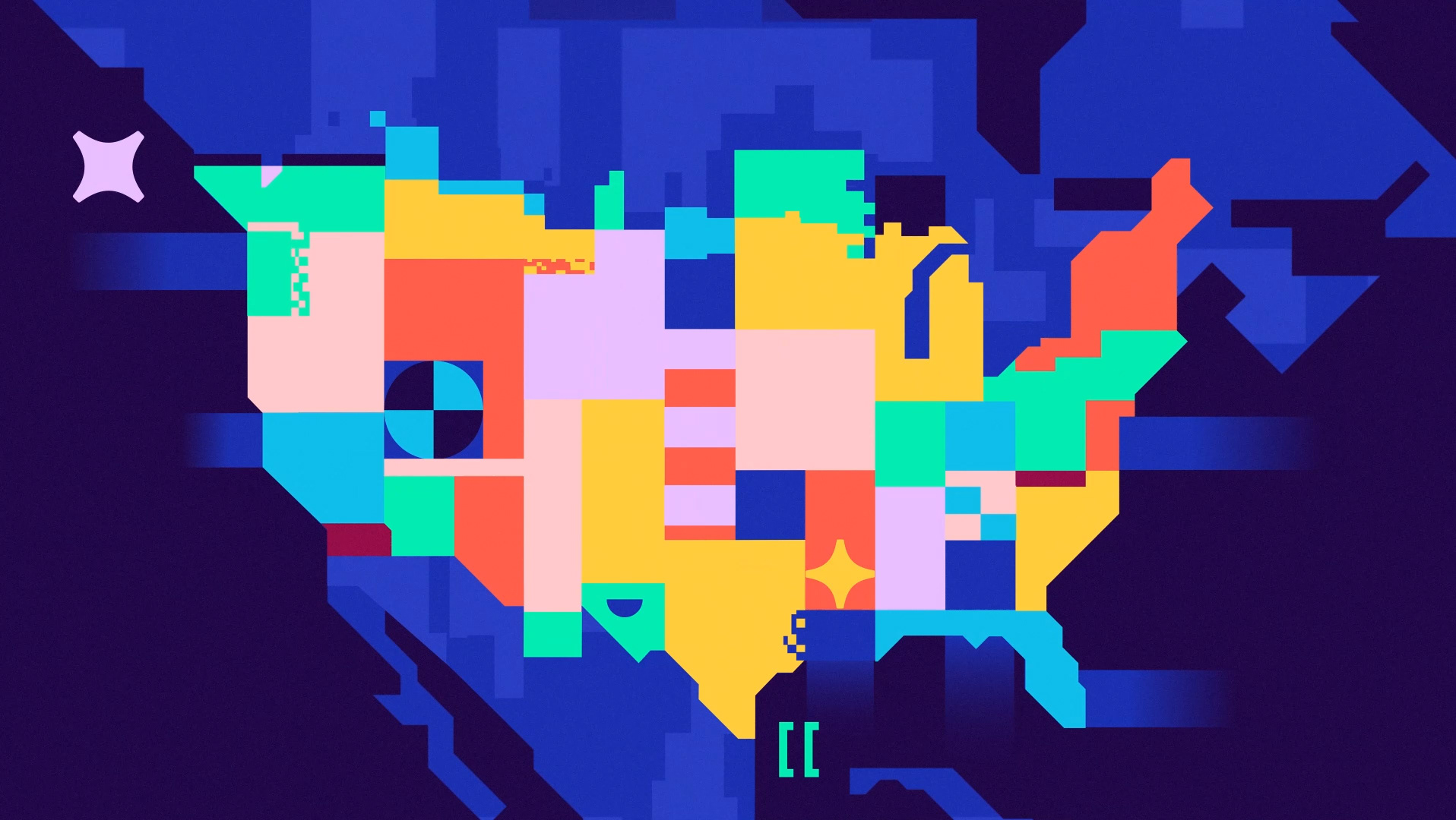
Content Bumpers
We used our Prism as the mechanism that drives the motion, diving into it to show the menu/layout that presents content and information about IP's.
The title size is flexible and automated, always being the biggest it can be inside a limited area of the composition. In that way, the title will always fill a similar space of the layout and makes the toolkit a bit more user friendly, removing the need of worrying about selecting the right font size for that text layer.
We delivered a variety of layout options so CN could use the layout that fits best what they need. On top of that, the motion toolkit allows the user to change a lot of things, like swapping the text title for the IP logo, using a glyph instead of the "tune in" text and other small things like footage change, color change and basic type automation to match design's rules.
Lower Third
Different from the usual lower thirds, in this one we had to consider CN's fixed bug at the bottom right. We used the bug as the starting point, diving into the prism just like other assets as the customizable texts are revealed.
The L3 has an automated rig that resizes depending on the type width, for both title and subtitle. This allows the toolkit to accommodate any length of title, without fixed box sizes.
Transitions
The transitions were also based on the prism, two of them reflects what we did for the other assets and the other two introduces a new fan behavior, that aim to show the prism layering in a different way.
Credits
Client: Cartoon Network
Production: BUCK
Executive Creative Director: Luisa Murray
Executive Creative Director: Joe Mullen
Executive Producer: Emily Rickard, Kirsten Collabolletta
Creative Director: Jeni Wamberg
Associate Creative Director: Kirk Johnson
Senior Art Director: Eduardo Gooda
Brand Strategy Director: Marla Moore, Asia Hunt
Producer: Andrew Chan Gladstone, Adam Reeb
Copywriter: David Evans
Design: Jose Flores, Joel Plosz, Vicky Chong, Emilia Tonello
Animation: Adelir Boeira, Filipe Consoni, Esteban Esquivo, Nick Petley
Editors: Billy Kostka, Robert Bailey
Music & Sound Design: Antfood